Refreshing a Brand Rooted in Community and Golf
Overview
Somerby Golf Club is a destination rooted in community, landscape, and tradition. The challenge was to modernize the brand without erasing the familiarity and character that made it meaningful to its members.
The refresh needed to elevate sophistication, bring consistency across touchpoints, and support three distinct business areas—Membership, Real Estate, and Golf—while maintaining a cohesive, unified identity.
EldrBrandr's Role
Creative Direction • Brand Refresh Lead • Visual Storytelling
Led the brand refresh from strategy through rollout—aligning identity, photography, and messaging into a flexible system designed to serve both members and the broader community.
The Challenge
Somerby’s existing brand had grown fragmented over time. Marketing materials, signage, photography, and communications each told a slightly different story. The identity felt dated, and the lack of cohesion made it difficult to clearly distinguish offerings without creating brand confusion.
The challenge was balance: modernize the brand while preserving its warmth, approachability, and deep connection to place.

The Approach
A restrained, system-based refresh guided by the belief that modernization should clarify and elevate—not overwrite—the warmth, familiarity, and sense of place that define the Somerby experience.
Brand Essence & Mood Exploration
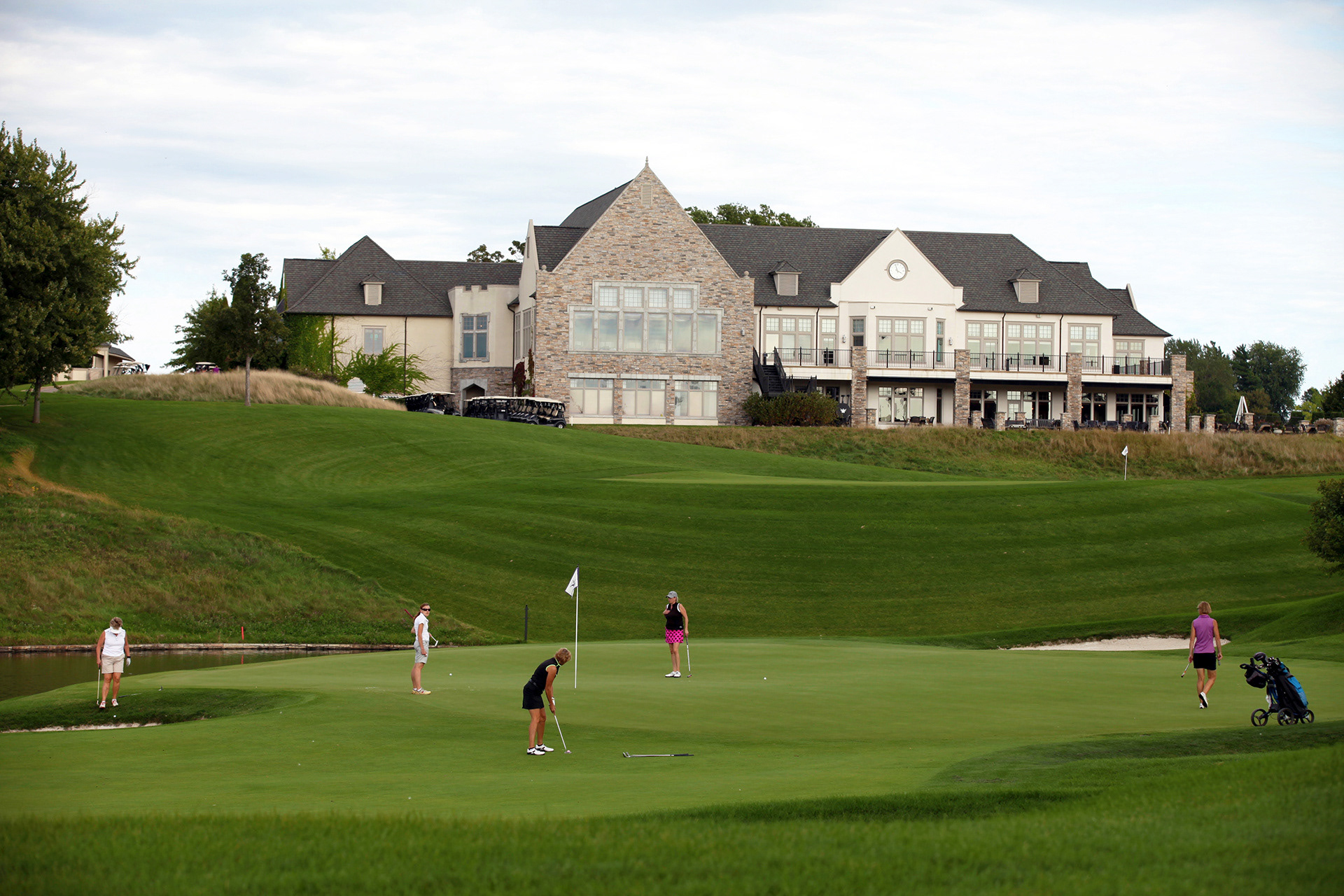
Defined an emotional foundation rooted in community, landscape, and approachability. The work centered on capturing the experience of Somerby—not just the game—balancing casual elegance with the natural beauty of the course and the relationships built around it.
Visual Identity Refresh
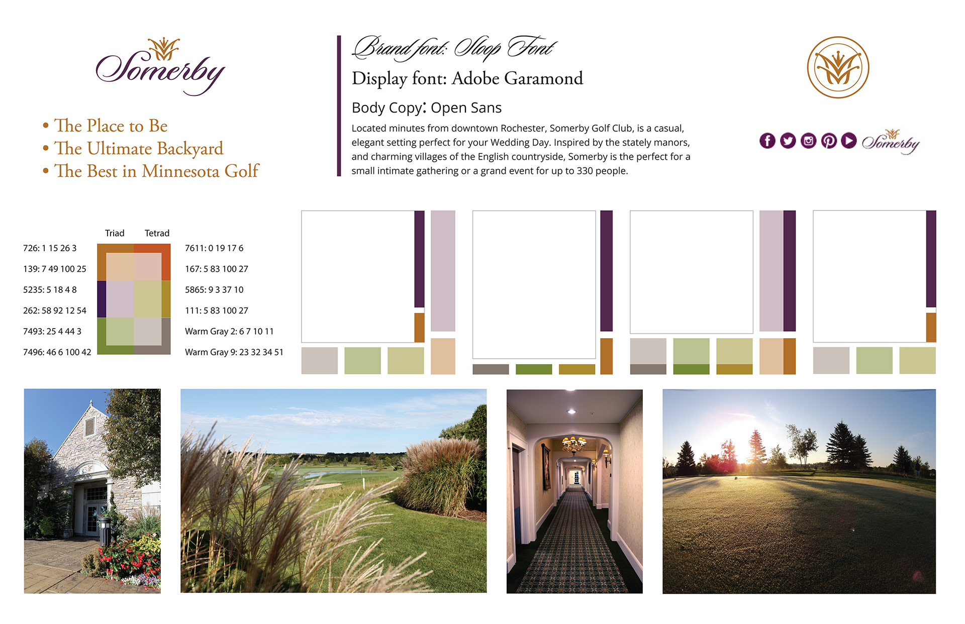
Modernized the identity through refined typography, color, and layout systems—establishing consistency across touchpoints while allowing flexibility for Somerby’s distinct business areas. The result was a cohesive, scalable system capable of supporting Membership, Real Estate, and Golf without fragmentation or brand fatigue.
Photography & Storytelling
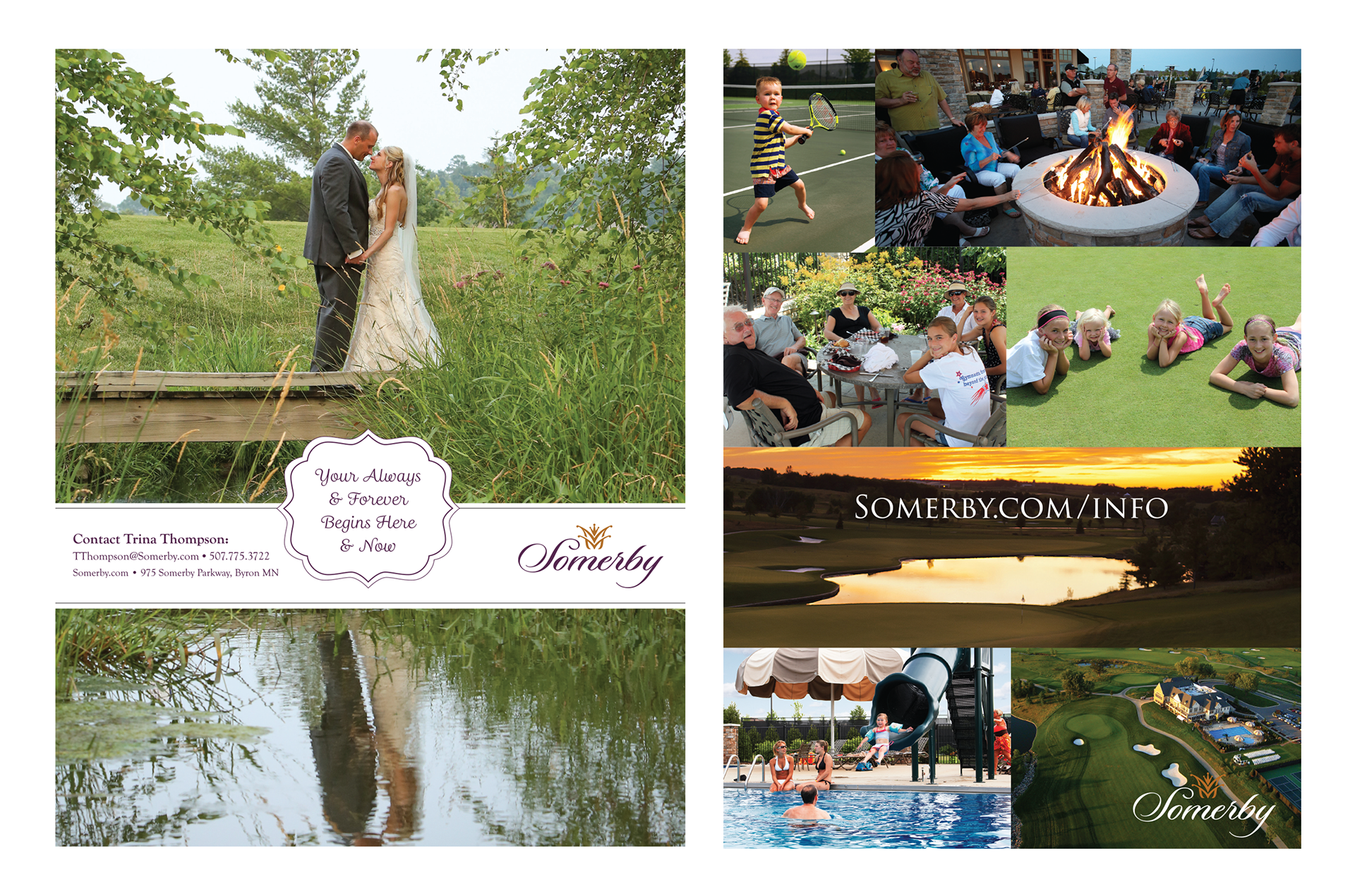
Directed a photography style focused on people, place, and atmosphere. The visual language balanced environmental beauty with human moments, reinforcing Somerby’s sense of belonging and elevating storytelling across marketing and communications.
Rollout Creative
Activated the refreshed brand across membership materials, events, environmental signage, and digital channels—ensuring consistent expression while allowing each touchpoint to feel natural and experience-driven rather than promotional.
The Result
A refreshed brand that strengthened Somerby’s sense of place while clarifying its offerings and elevating perception across membership, real estate, and golf.
The system brought cohesion without rigidity—allowing the brand to evolve naturally while preserving the warmth, familiarity, and community connection that define the Somerby experience.